Ecomverse education platform presented across a laptop and supporting interface panels
Education commerce / connected learning journey
Case study / Education commerce

Ecomverse

I redesigned the full buyer journey so the offer, student proof, free resources and application path support one clear decision.

Role UX strategy, visual design & WebflowDeliverables Website system & connected sales pagesPlatform Webflow
Ecomverse homepage, testimonial system and learning program interface
Final experience overviewHomepage · Education · Results · Application support
The design problem

The offer was strong. The route to believing it was fragmented.

Ecomverse combines a digital course platform, weekly coaching and a founder community. The earlier site held plenty of information and proof, but visitors had to assemble the story themselves.

I reorganized the website around the questions a prospective student asks: Is this for me? How does it work? Can I trust the outcome? What happens after I apply? The redesign connected those answers across the homepage, education pages, VSL, reviews, pre-demo and confirmation states.

Client
Ecomverse
Audience
Aspiring e-commerce founders
Scope
UX, visual system, page design and Webflow build
Client-reported outcomeNearly 3×

conversions after the website redesign

The client explains the change

“This website almost tripled our conversions.”

The client credits the start-to-finish process: deciding what belongs at the top, where service explanation and testimonials should appear, then carrying the wireframe through visual design, technical fixes and launch support.

Source: the client's published testimonial. The metric is attributed feedback rather than independent analytics verification.

The sales questions, answered

What changed, what mattered most and why the journey became easier to trust.

A prospective client should not need a follow-up interview to understand the work. These are the five questions the redesign answers.

01 / What exactly changed?

What did you do that helped the website convert nearly three times better?

I turned disconnected content into a guided buyer journey. The redesign clarified the opening promise, introduced proof earlier, distributed video testimonials throughout the story, created lower-friction free resources and kept the application experience consistent after the first click.

  • Clearer message hierarchy
  • Proof beside high-stakes claims
  • One consistent route from interest to application
02 / What mattered most?

Which single decision likely carried the most weight?

The strongest design lever was proof timing. Trustpilot, member-generated revenue and real student videos appear before a visitor has to make a high-commitment decision. This is a UX inference from the live page structure. The near-3× result comes from the client’s testimonial and does not isolate a single causal factor.

03 / What does SEK prove?

Why place the member-revenue number so close to the opening promise?

SEK is Swedish krona. The live figure represents cumulative revenue reported from members’ stores. It is separate from Ecomverse company revenue, my project fee and redesign analytics. It turns a broad education promise into visible commercial activity and gives the visitor a concrete reason to keep reading.

04 / Why so much video?

What role did student testimonials play?

Video lets prospects see a real person, context and outcome together. A broad interview library also answers the quiet question, “Is there someone here like me?” The videos support the homepage, results section and application journey instead of living in a single isolated gallery.

05 / Was it only a homepage redesign?

How did the wider page system support the result?

Every page carries one part of the decision. The free course creates a low-risk first step. The VSL explains the method. Interviews make outcomes specific. The FAQ resolves practical concerns. The application and confirmation states preserve momentum through the final action.

Live proof system

Three signals answer three different doubts.

The values evolve as Ecomverse updates its website. Their design role stays consistent: independent trust, commercial activity and speed to first progress.

Independent trust400+

five-star Trustpilot reviews

A third-party signal reduces reliance on brand-authored claims.

Time to progress22 days

average time to first sale

A specific milestone helps a new visitor imagine an achievable first step.

Live Ecomverse claims reviewed September 2026. These figures describe Ecomverse member outcomes. They are not independent analytics for this redesign.

Information architecture

Thirteen page types. One continuous decision journey.

The source sitemap defines a complete content and sales system, including education, proof, lead capture, application support and post-action continuity.

  1. 01DiscoverHomepage · Blog · Author pages
  2. 02UnderstandEducation · VSL · Pre-demo
  3. 03TrustResults · Reviews · Interviews
  4. 04ActGuide opt-in · Application · Calendar
  5. 05ContinueThank-you · Support · Policy
Homepage redesign

The first screen now makes the next decision obvious.

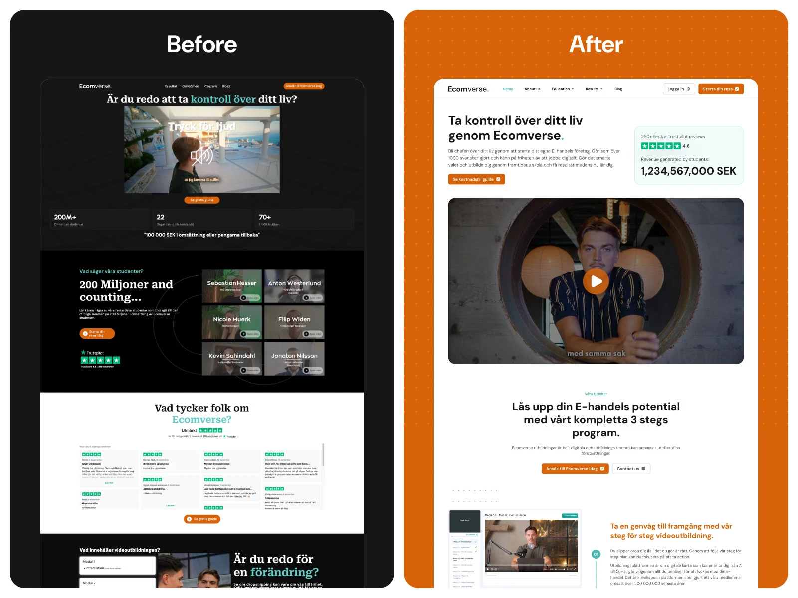
The redesign retains the strongest credibility signals, but gives each one a deliberate place in the reading sequence.

Ecomverse before and after homepage comparison showing the new information hierarchy
Source-backed comparison: earlier homepage and redesigned homepage
01 / Relevance

One opening promise

The headline explains the desired change before the visitor meets program detail.

02 / Confidence

Proof beside the claim

Trustpilot, student revenue and video evidence answer doubt where it forms.

03 / Action

One primary route

The free-guide CTA creates a lower-friction first step while the application path remains available.

Proof architecture

Video testimonials became part of the page logic.

The homepage does not hide student stories inside one decorative carousel. Video, review and result evidence are distributed around the claims they validate.

Ecomverse testimonial wall and homepage proof system
  1. Independent credibilityTrustpilot establishes third-party confidence close to the opening promise.
  2. Quantified relevanceMember-generated SEK revenue makes the scale of commercial activity concrete.
  3. Human specificityNamed video stories show different student contexts instead of one generic endorsement.
  4. Decision supportTestimonials return beside program explanation, free resources and application prompts.
Lead magnet system

Three useful resources turn interest into a guided next step.

The books are functional entry points, not decorative merchandise. Each one addresses a different stage of readiness and gives Ecomverse a relevant reason to continue the conversation.

MasterclassHitta vinnande produkter

Product discovery

A focused resource for visitors still evaluating what to sell.

Mini courseBygg din första butik

First-store momentum

A practical bridge from curiosity to the first visible build step.

ChecklistDropshipping A–Ö

Process clarity

A structured reference for visitors who need the full path before applying.

Ecomverse custom e-commerce illustrations and three branded lead-magnet books
Custom topic illustrations and branded lead-capture resources
Design language

A reusable visual grammar keeps dense education content familiar.

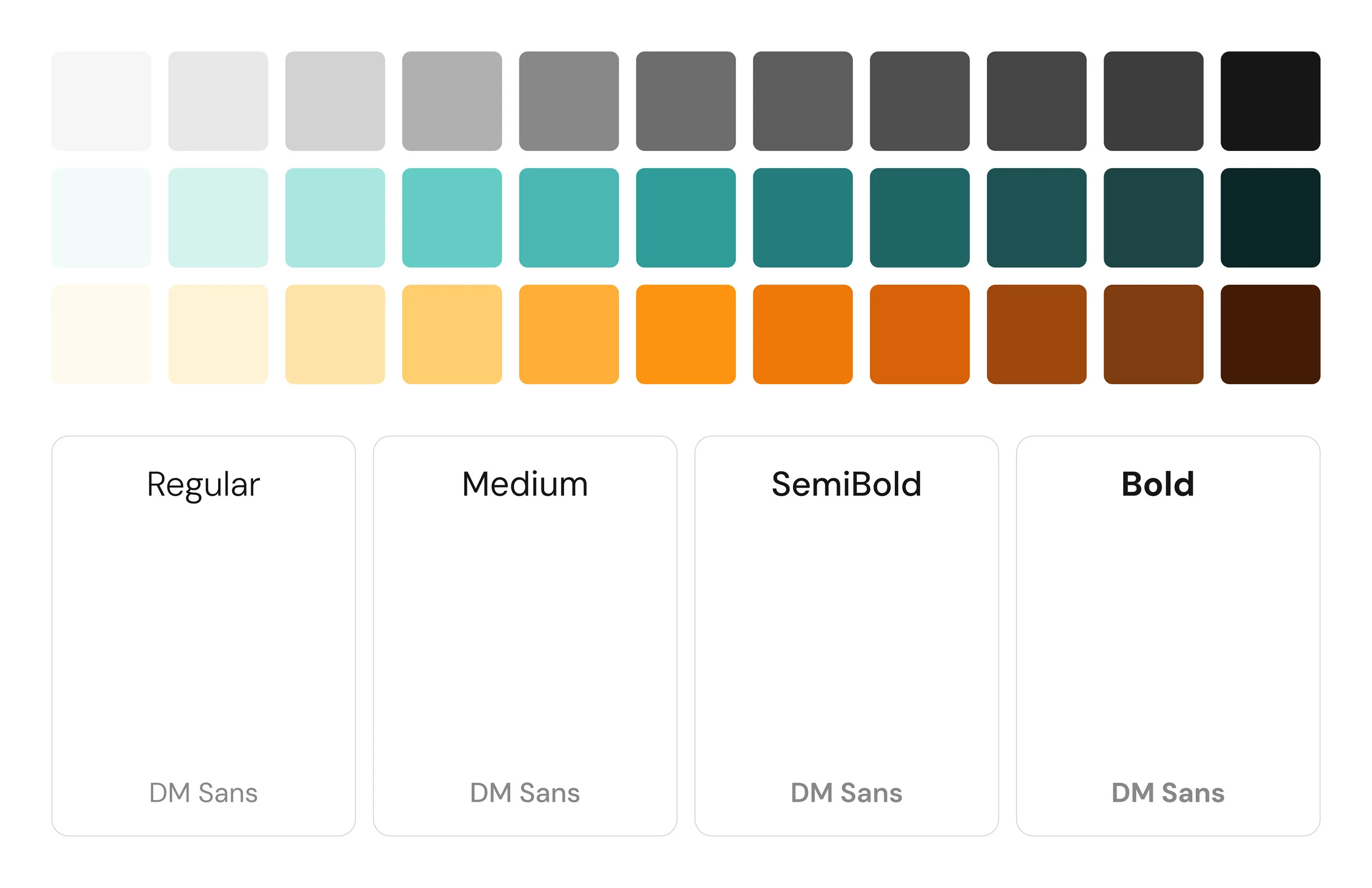
Orange signals action, teal supports explanation, and a custom icon family makes e-commerce concepts recognizable before a visitor reads the supporting copy. Reusable rules let new lessons and landing pages feel part of the same product.

  • Orangedecisions, calls to action and forward movement
  • Tealguidance, progress and supporting proof
  • Iconsconsistent recognition across programs and resources
  • DM Sansopen reading rhythm for long educational pages
Ecomverse color and typography system
Color and type rules used across the page family
Page-by-page decisions

Every page has a specific job in the sales conversation.

The source design file and sitemap show a system that extends well beyond the homepage.

Homepage

Establish the promise

One promise, Trustpilot, member revenue, student videos and a clear route into Mastery.

View live page
Free Entry course

Lower the first commitment

A free course covers product research, roadmap, mindset, goals and viral marketing before asking for a larger decision.

View live page
VSL + application

Build sales-call readiness

The method, quantified proof and application questions prepare the visitor for a more committed conversation.

View live page
Member interviews

Make outcomes specific

A broad library of named stories, timeframes and revenue milestones helps different prospects recognize themselves.

View live page
FAQ

Resolve practical risk

Cost, timing, experience, financing and the application process are answered before they become sales-call friction.

View live page
Application complete

Preserve momentum

The confirmation state keeps context after submission and makes the next step feel expected.

View live page
Why the redesign converted better

Experienced UX made the value easier to understand and the next action easier to choose.

The client reported that conversions almost tripled. The design rationale behind that result is visible throughout the site: sharper message sequencing, proof at the point of doubt, useful lead magnets, consistent calls to action and continuity after application.

≈3×Client-reported conversions
13Defined page types
1Connected decision system
Continue exploring

Selected Work

View all projects ↗