Keep the product visible.
The drone needed to remain part of the story as visitors moved from the opening promise into detailed evidence.
Product launch website for EXO Mini and Blackhawk 2
EXO needed a product website that made camera quality, flight performance and smart features easy to understand. I planned the UX, designed the interface in Figma, prototyped the scroll interactions and built the final experience in Webflow.
My role
 UX strategy
 Art direction
 Interaction design
 Figma system
 Webflow build
EXO wanted the product clarity of leading technology brands without hiding the specifications buyers need. The page had to explain the camera, flight system and smart features, keep a long journey easy to navigate and support a confident purchase decision.
The drone needed to remain part of the story as visitors moved from the opening promise into detailed evidence.
Resolution, bitrate, aperture, low-light capture and range needed visual demonstrations that explained what each number meant.
Clear chapters had to help visitors find camera, video, flight and smart-feature information without watching every animation.
Comparisons, included accessories and safety features needed to answer the practical questions buyers ask before ordering.

I prototyped how the drone, content and camera evidence would move between sections before building the page. I used the prototype to check timing, readability and product focus early, then carried the approved sequence into Webflow.
I mapped the content order, prepared the wireframes, developed the visual direction and documented colour, typography, spacing and interaction states in Figma. The same system covered EXO Mini, Blackhawk 2 Pro and responsive handoff.
Built to make advanced flight technology feel precise, premium and easy to compare. This system comes from the original hidden Figma style-guide page.
Navy carries engineering authority. Electric blue isolates actions and active states. Cool neutrals keep product imagery and camera proof visually dominant.
DM Sans gives the launch wide, confident headlines and clean technical data. One family reduces noise while scale and weight create hierarchy.
Large spacing separates product chapters. Compact spacing groups proof. Four explicit button states support the long interactive journey.


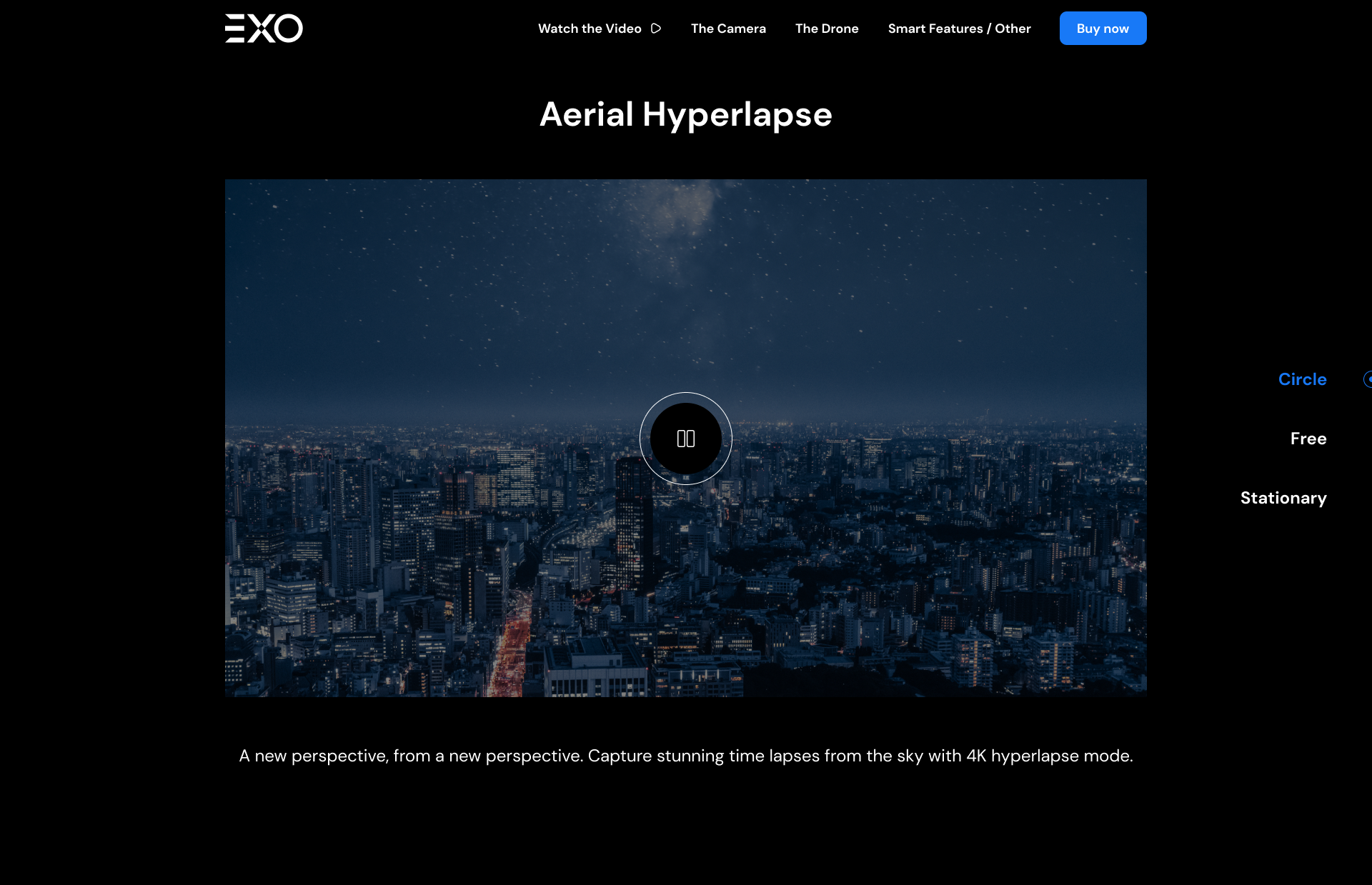


I divided the page into camera, image quality, flight modes and purchase confidence. Each section answers one group of buyer questions before introducing the next, so technical detail stays clear instead of becoming one long specification sheet.
Resolution, sensor size, bitrate and HDR are grouped around the camera output they improve, making the numbers easier to understand.
The buying experience could not become generic after a detailed product story. I customized the cart to keep the selected drone, bundle, quantity, compatibility, delivery and warranty information visible while buyers reviewed their decision.
The final delivery connected the approved Figma system, responsive layouts, scroll interactions, commerce decisions and product evidence in an editable Webflow build.
Camera, image quality, flight modes and smart features are separated into focused chapters that are easier to scan and compare.
The customized cart keeps the selected configuration, compatible add-ons and purchase reassurance connected to the drone.
Scroll movement introduces the product, explains transitions and keeps the drone connected to the information on screen.
The approved hierarchy, responsive layouts and interaction rules were carried into an editable live website.
Client reviewView live website ↗“Adil is one of the best freelancers I have worked with! He did a fantastic job designing and building my Webflow website.”
